Design and Illustration by the “Early Influencers” working in the Record Business
(The second of a two-part article)
Now that you have had the chance to read the first part of this article, I now hope that you have fully absorbed the basic introduction I provided to the often-complex nature of how groups of individuals—all with a wide variety of backgrounds, talents, and motivations—come together to work on projects to produce the wide variety of visuals needed to help promote and sell recorded music products. And since you now know “who does what,” I believe that it is time for you to meet some of the most-notable purveyors of note-worthy and memorable album packaging and read what they have shared about what they do, why they do it, and what the future holds for this unique craft.
You will recall that, after a project’s design brief has been established (however formally or informally it has been documented), it is now up to the designers and illustrators/typographers/photographers—whoever has been selected to actually create the basic imagery—to translate whatever directions they’ve been given into those building blocks from which a complete cover/package image will be built. In gathering content for my writing—mostly, via an ongoing series of interviews I have done with many of the best-known and most-prolific producers of album cover imagery—I have been able to elicit some very interesting quotes from these people that I feel go a long way towards helping to illustrate how successful they are at maintaining an important balance between producing what they want (or feel is “right”) versus what ultimately makes their managers and clients happy with their efforts. I will first spend a little time introducing you to the people who gave us our first album cover packages—I call them the “Early Influencers”—and then follow those introductions up with some interesting quotes that I have gathered about a variety of cover art-related questions from a number of the best-known practitioners of the fine art of the album cover.
Early Influencers – An introduction to the Designers and Illustrators who advanced the importance of album covers and record packaging in the modern music era.
I think that it is also important to note at this point that while the Album Cover Hall of Fame (ACHOF) does focus primarily on the best rock and pop music-related cover art and artists (vs. works done for musical acts working in the jazz, classical, and other musical genres), it is important to realize that it took a number of years, with countless examples of successful and failed work, for the modern music industry overall to move from selling their products in plain paper sleeves (which looked just fine next to the sheet music and music instruction books that were on the shelves or in the bins next to them) to the eye-catching packages that were meant to introduce you somehow to the music packaged inside. And clearly, while the record labels were hesitant to increase their production and packaging costs, once they were able to gauge the public’s response to these new packages (and saw that the buying public LOVED them), they quickly cost-justified the additional investments and thus began a new era in tying the visual arts to music.
Included in this list are the names of people who have been credited in a variety of books and magazines as having introduced the public—through their trend-setting works—to the art of the modern album cover. If you would like to view more of an artist’s work in this area, I invite you to visit the links provided or reference one of the many books and websites used during the research phase of the ACHOF nominating process (you can find a listing of these books/sites here).
Early Influencers – (Name, Work History, and Sample of Album Cover Credits)
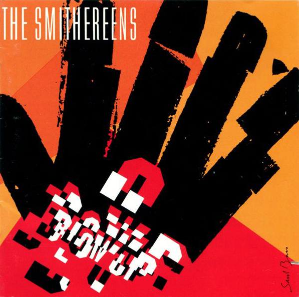
Saul Bass – Art Director/Graphic Designer/Animator – freelance for labels including Decca, RCA/Victor, Capitol, and Columbia Records from 1954 to 1968. Clients included Otto Preminger, Alfred Hitchcock, Martin Scorsese, and The Smithereens. Mr. Bass applied his talents to projects in the film, television, music, and commercial art arenas, creating famous logos including those for AT&T/Bell Telephone, Dixie Products, Kleenex, Quaker Oats, United Airlines (and many others), and movie posters and storyboards for scores of films. As a film-maker himself, Bass won an Academy Award in 1968 for his short film titled Why Man Creates.
More information available at http://en.wikipedia.org/wiki/Saul_Bass
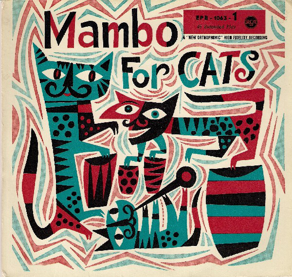
Jim Flora – Art Director/Designer for Columbia Records from 1943 to 1950; freelance for RCA/Victor Records from 1954 to 1956. Clients included Louis Armstrong, Gene Krupa, Andre Previn, Lord Buckley, and Jimmy Dorsey. Flora was also a much-sought-after commercial illustrator for over forty years, during which time he also wrote and illustrated a number of popular children's books, including titles such as The Fabulous Firework Family in 1955, The Day the Cow Sneezed (1957), and Wimple in 1972. After retiring from commercial design in the late 1970s, Flora would spend most of the remaining years of his life sketching, drawing, and painting, producing a huge archive of images. In 2013, Fantagraphics Books published a compendium of his music industry work titled The High Fidelity Art of Jim Flora.
More information available at http://en.wikipedia.org/wiki/Jim_Flora
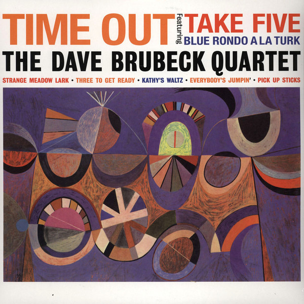
S. Neil Fujita – Art Director/Designer for Columbia Records from 1953 to 1957 and 1958 to 1960. Clients included Dave Brubeck (Time Out), Miles Davis (Round About Midnight), Chet Baker, Dick Hyman, The Jazz Messengers, Charles Mingus, and others. Born in Hawaii to Japanese immigrant parents, Neil was schooled in the arts at the prestigious Chouinard Art Institute until WWII interrupted and, like so many Japanese-Americans, he was sent to an internment camp. He enlisted in the Army and, after the war, resumed his studies. His initial work in advertising caught the attention of Columbia Records, where he worked before starting his own agency in the early 1960s, specializing in book covers (prime examples include the covers for In Cold Blood and The Godfather), before turning to teaching.
More information available at http://www.aiga.org/content.cfm/waxing-chromatic-an-interview-with-s-neil-fujita
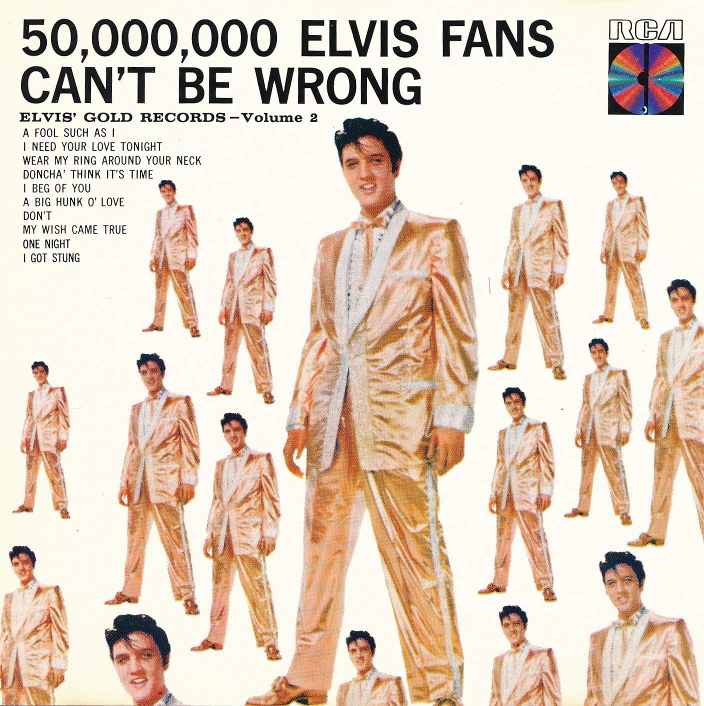
Robert M. “Bob” Jones – Art Director/designer for Columbia Records from 1944 to 1950; freelance from 1950 to 1953; Art Director/designer for RCA/Victor Records from 1953 to 1975. Clients included Benny Goodman, Frank Sinatra, Doris Day, and Elvis Presley. Jones began his career in the 1940s at Columbia Records, working alongside Alex Steinweiss and Jim Flora as one of the first artist/designers to take advantage of the 12” LP cardboard canvas. While working at RCA/Victor into the mid-1970s, he also enjoyed working as a pressman of limited-edition prints, handbills, posters, and art books via his Stamford, Connecticut-based publishing house called Glad Hand Press. Jones was nominated for twenty-three Grammy Awards for his album cover work, winning six of them between 1959 and 1967.
In an article on the topic written for the November 1960 issue of American Artist magazine, Jones wrote, "I believe no industry in the United States offers a wider range of expression and artistic technique than the approximately 300 recording companies. Annually they produce between 7,500 and 8,000 different recordings, all of which require artwork for their packaging."
More information available at http://www.birkajazz.com/archive/rca.htm
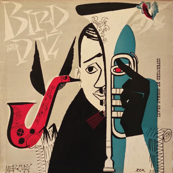
David Stone Martin – Designer for Asch Records from 1944 to 1947; Art Director/designer for Clef/Norgran/Verve Records from 1948 to 1955; freelance for Verve, Atlantic, RCA/Victor, Down Home, and others .
Born in Chicago and a student at the school of the Art Institute there, Martin specialized in illustrations done with pen and ink and, ultimately, created over 400 album covers for a long list of musical clients including jazz greats such as John Coltrane, Charlie Parker, Harry Edison, Lester Young, Billie Holiday, Mary Lou Williams, and Oscar Peterson. In the 1950s and ‘60s, Martin expanded his portfolio to include work for television and magazines including CBS and The Saturday Evening Post.
More information available at http://en.wikipedia.org/wiki/David_Stone_Martin
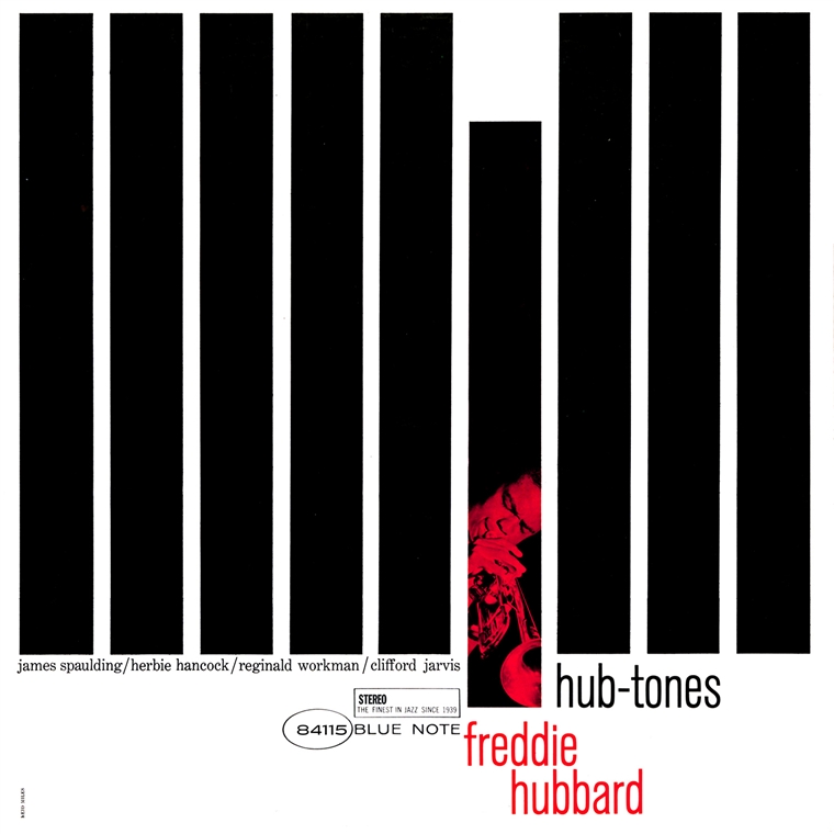
Reid Miles – Agency designer for Blue Note Records from 1956 to 1967; freelance photographer for various labels from 1967 to 1993. Clients included Sonny Clark, Kenny Burrell, Cannonball Adderley, Herbie Hancock, Ornette Coleman, and Chicago. Originally born in Chicago, Miles’ family moved to Southern California in the late 1920s, where he enrolled in the Chouinard Art Institute after serving a stint in the Navy during WWII. After graduation, Miles moved to New York City, where he worked freelance for John Hermansader at Blue Note Records, joining the staff full time in 1956 to work alongside photographer (and label co-founder) Francis Wolff and, together, produced hundreds of notable album covers.
More information available at http://en.wikipedia.org/wiki/Reid_Miles
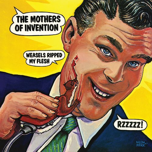
Martin Muller AKA Neon Park – Notable album cover work examples – Frank Zappa – Weasels Ripped My Flesh; Little Feat – Dixie Chicken, Sailin’ Shoes, Waiting For Columbus, Hoy-Hoy!, and Shake Me Up; Y&T – Down For The Count; and Lowell George (solo) – Thanks I’ll Eat It Here.
Originally a poster designer for the Family Dog/Avalon Ballroom group in San Francisco, Park became the go-to illustrator for Frank Zappa, Little Feat, and other Bay-area acts. He later was hired to produce covers for The Beach Boys, David Bowie, and Dr. John and contributed to Robert Crumb’s Zap! Comix. He also produced a series of illustrations for publications including Playboy and National Lampoon.
More information available at http://en.wikipedia.org/wiki/Neon_Park
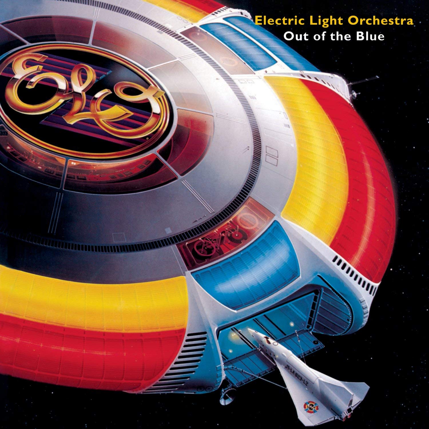
Shusei Nagaoka – Notable album cover credits include – Electric Light Orchestra – Out of the Blue; Earth, Wind & Fire – Helios, Gratitude, Raise!, All ‘N All, and The Best of Earth Wind & Fire Vol. 1; Deep Purple – When We Rock We Rock and When We Roll We Roll; Pure Prairie League – Can’t Hold Back; Jefferson Starship – Spitfire; Parlet – Pleasure Principle; Shalamar – Uptown Festival and Disco Gardens; Maze – Inspiration and Joy & Pain; and Kitaro – Oasis.
Born in 1936 in Nagasaki, Japan, Nagaoka’s family moved to the island of Iki prior to the devastation of his hometown in 1945. After attending art school in Tokyo in 1958, he began his career in illustration, with his talents quickly gaining wide acclaim. A visit to the U.S. in 1970 impressed him so much that he relocated there, opening an office where he might better-serve his clients in the music, films, and publishing worlds.
More information on this artist is available on his web site at http://www.shusei-nagaoka.com/english/index.html
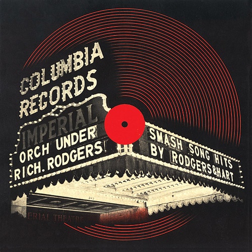
Alex Steinweiss – Art Director/Designer for Columbia Records from 1939 to 1943 and (freelance) 1948 to 1950; Freelance designer/Art Director for Remington, Decca/London, and Everest Records from 1950 to 1974. Mr. Steinweiss is perhaps best-know for having introduced the first individually-designed record cover (Smash Song Hits by Rodgers & Hart) in 1940 and later pioneering the use of cardboard sleeve-based packaging for 33-1/3 RPM LPs in 1948. Clients included Cole Porter, Bing Crosby, Woody Herman, and Andre Kostelanetz.
More information available at http://www.aiga.org/content.cfm/medalist-alexsteinweiss
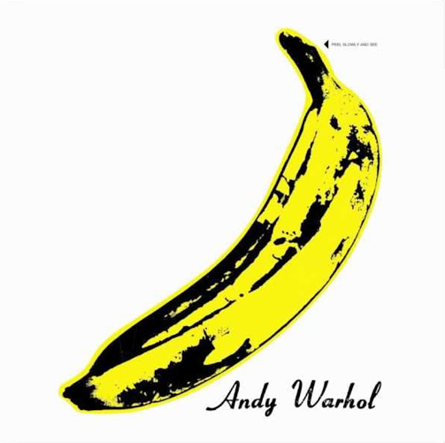
Andy Warhol – Notable album cover work examples – Kenny Burrell – Kenny Burrell and Blue Lights Vols. 1 & 2; Rolling Stones – Sticky Fingers and Love You Live; Velvet Underground – Velvet Underground & Nico and White Light/White Heat; John Lennon – Menlove Ave., Diana Ross – Silk Electric; John Cale – The Academy in Peril; Aretha Franklin - Aretha; Debbie Harry – Rockbird; Lou Reed – Retro; Billy Squier – Emotions in Motion; Paul Anka – The Painter; and Rats & Star – Soul Vacation.
Born Andrew Warhola in August 1928, he earned his BFA in Pictorial Design in 1949 before moving to New York City to find work as a commercial illustrator. After the first of his works appeared in Glamour magazine in late 1949, his unique illustration stylings caught the attention of many clients, and his career in the field grew quickly throughout the 1950s. In 2008, author Paul Marechal published a compendium featuring the artwork and stories behind the fifty album covers—for early jazz clients, rock bands, and solo performers from many genres of music—that Warhol produced during his career in a book titled Andy Warhol: The Album Covers 1949–1987.
More information is available at https://www.warhol.org/andy-warhols-life/
And now, some quotes from some of your favorite album cover creators –
Whenever I interview an album cover artist, the discussions tend to focus on their inspirations, the processes they follow, and the relationships that existed when they were asked to collaborate with their clients in the recorded music business. While, anecdotally, these stories were usually quite entertaining and informative, I always wanted to know more about the people I was interviewing and, over time, developed a series of questions that I would use to elicit more from these talented people. This was necessary because, at least half the time, my interview subjects kept both story particulars and their emotions “close to their chests,” and so it was up to me to draw the more-intimate details out as best I could.
The questions I developed helped elicit opinions of the people I quizzed about three primary topics –
1) if they thought that album cover art helps document modern human history and whether the works they created had any noticeable effect on Pop Culture,
2) whether emerging technologies served to open doors to new possibilities or, instead, ultimately stifled creativity via "sameness" and the increased possibilities that an artist’s work will be “borrowed” without their knowledge (and any due compensation), and
3) in general, whether or not album art matters any more (to fans, musicians, and the people that promote music)?
While my interviews have been with people working in every aspect of the music packaging/promo business, for this article I am going to concentrate on delivering commentary from folks best-known for their work as illustrators and typographers. I have included some examples of their works after their names and then highlighted the specific questions I had asked them to provide the proper context…
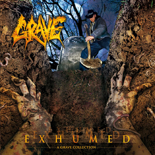
Mike Hrubovcek – singer for bands including Divine Rapture and Monstrosity and noted illustrator for metal/hard rock albums such as Grave – Exhumed, Sinister – Legacy of Ashes and Carnage Ending, and Mr. Death – Detached from Life.
Do you think that album cover art helps us document modern human history?
Mike H - Certainly. In the Death Metal scene, for example, a lot of the artwork subject matter has gotten so dumbed down and desensitized—it's gone so far beyond brutal—that it seems to be a parody of itself, reflecting the state of humanity in the present. It’s seen it all, spoiled itself, demands immediate satisfaction, and has no patience for the depth of content of history or the important lessons it can teach us. But I think everything is a cycle. Once one thing is forgotten, it is re-learned or brought back as "new" sometime later, but will also die and be left behind again. As with everything in life, art is a heaving and breathing monster.

Gerard Huerta – renowned designer of logos, fonts, and other specialized lettering and imagery, perhaps best-known to music fans for his logos for AC/DC, Boston, Blue Oyster Cult, Foreigner, and Ted Nugent (among many others).
Does album cover art really matter anymore?
Gerard H - Album art imagery was married to the music when 12.5" by 12.5" covers existed. Then, with the introduction of MTV, a video was the visual that accompanied a song. Album art has become such a diminished part of the music package today. It started with the physical down-sizing of audio tapes and CDs, and now with downloading, the imagery on iPods and smart phones that play music is so small that there is little or no room for interesting visuals.
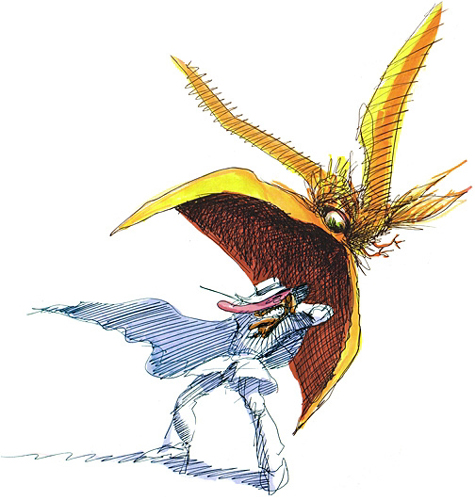
Overton Loyd – illustrator and designer with notable album cover credits including Parliament - Motor Booty Affair; Zapp - Zapp; George Clinton & The P-Funk All Stars - Dope Dogs, The Greatest Funkin' Hits, T.A.P.O.A.F.O.M, Live and Kickin', and How Late Do U Have 2 B B 4 U R Absent?; Bill Laswell - Moody's Mood For Love; and Nat King Cole - Re: Generations.
Does album cover art matter anymore?
Overton L - I personally don’t feel album art matters as much as it did in the past, but that’s just my own opinion. I originally created images to give fans a behind the scenes glance at the performers. Now I think that all can be achieved via social networking, electronic delivery, periscope, apps, etc. However, I’m told that many die-hard consumers will always crave album artwork. I’m sure future content will be virtual - holograms, etc.
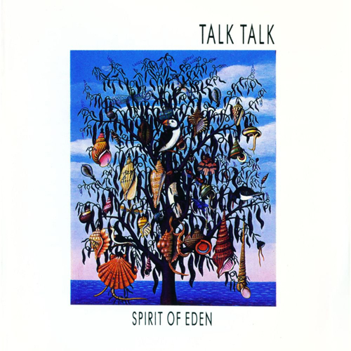
James Marsh – designer, illustrator and writer with a list of album cover credits that includes – Talk Talk – Spirit of Eden, Laughing Stock, and After The Flood; Jamiroquai –Emergency on Planet Earth; The Lovetones – Lost; and Steeleye Span – Now We Are Six.
Does album cover art matter anymore?
James M - Interesting creative work is being produced continuously; however, I only get to see a small percentage of it, usually via the online graphic or art related sites who have deemed them worthy. Obviously, established bands can afford to invest in something innovative, and some of those projects, by their very nature, need large budgets, particularly on videos, for example. Yes, album art still matters. Even if the music is only available to download, an image is necessary to avoid simple lists and be individual.

Dave McMacken – this Astoria, Oregon-based designer and illustrator has a list of album cover credits that includes – Frank Zappa – Over-nite Sensation, AC/DC – Ballbreaker, Warrant – Dog Eat Dog, Weather Report – Black Market, The Beatles – Reel Music, Steve Miller – The Joker, and Kansas – Leftoverture.
Does album art matter anymore?
Dave M - I hope album cover art will return and, with an increasing awareness of vinyl records, it just might. What's really missing is the record design process, but I'm an old fart and, for sure, a bit out of the loop! I love the music scene now and since music art is part of the culture just as much as music is, anything that gets the kids dancing is what's happening. These images will last forever as each generation looks for its own voice. And the better the art, the better the music sells.
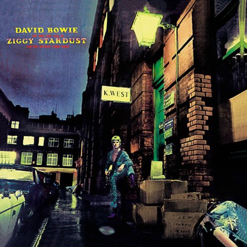
Terry Pastor – this U.K.-based illustrator and photographer’s impressive list of album cover credits include - David Bowie – Ziggy Stardust & The Spiders From Mars and Hunky Dory; Soft Machine – Six; The Beach Boys – 20 Golden Greats; Sweet – Off The Record; Imagination – Body Talk; The Flicks – Go For The Effect; Camel – A Live Record; Byzantium – Byzantium; and Ariel – A Strange Fantastic Dream.
Do you think album cover art helps us document human history?
Terry P - Definitely but, in fact, all art—commercial or fine—is a snapshot of social history, and for people that dismiss art as a throw away or "also ran”, I think that, if the last 500 years of art was wiped out, the world would be a much sadder place. Ars longa, vita brevis.
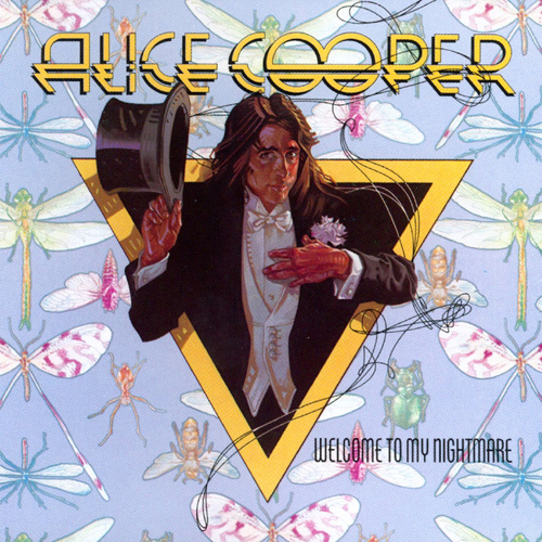
Drew Struzan – this renowned illustrator, besides his credits for album covers including Bee Gees – Main Course, Black Sabbath – Sabbath Bloody Sabbath, Alice Cooper – Welcome to My Nightmare (one of Rolling Stone Magazine’s “100 Top Album Covers of All Time”), and others is also one of the most-prolific movie poster artists of all time, with credits including theatrical posters for Star Wars, Indiana Jones, Blade Runner, Risky Business, Hook, Hellboy, and the Harry Potter series, among many others.
Have your works been “borrowed” and used, without your knowledge, permission, or any compensation?
Drew S – Ah, "Borrowing"—yes, I am being borrowed from every day by many people for many uses. One can take it as an honor, recognition for good work and all. As for me, I've had so much borrowed from me that I don't take it as much of anything any longer. Artists steal from me... style, techniques, and compositions but, as they say, “what the hey.” At this point, it's just saying that I am the “master” and they are all learning by imitation, as artists have always done. Too bad I am not dead quite yet… I'm pretty much retired and look to leave something for others to pick-up on now. Some make a couple of bucks by borrowing, imitating, copying, and, if they make a living off it, it’s my gift to them as they need to live as well.
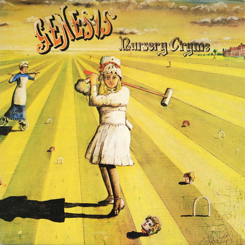
Paul Whitehead – illustrator/painter perhaps best-known for his covers for Prog Rock band Genesis (Trespass, Nursery Cryme and Foxtrot), with other credits including Van der Graaf Generator – Pawn Hearts and 68-71; Le Orme – Elementi and L’Infinito; Peter Hammill – Fool’s Mate; Redbone – Cycles; Renaissance – First & Illusion; and Charisma Records’ “Mad Hatter” logo.
Do you think that album cover art helps us document modern human history?
Paul W - Yes. I have made quite a study of this. As I’m in all the record cover books, I see a lot of covers that I have never actually encountered in the real world. Jazz covers—the ones from Blue Note in particular—are great and reflect those heady days of Jazz—pre Rock & Roll—and have a style and images of a lifestyle that was a little pocket in time. Then along came rock and all bets were off. By the time you got to the late ‘60’s, record covers were almost like magazines, they reflected the social and artistic issues of the day, and were the primary advertising image for the band. They also got into cut outs, embossing, and all kinds printing techniques that were very expensive and eye catching.
I hope that you have enjoyed this brief look into the world of recorded music packaging, album cover art, and the extra-ordinarily talented people who’ve spent their lives making music fans happy with their efforts. By the way, if you would like to keep up-to-date on the latest album cover art/artist-related news—interviews, exhibitions, new print and book releases, auctions, and other items of interest to fans of music-related fine art and photography—I would like to invite you to subscribe to my news feeds, available on my site (albumcoverhalloffame.com) or my social media sites on Facebook, Twitter, and LinkedIn.
One final interesting side note of particular interest to fans of illustration - as I was doing the research for my book, I was introduced to the efforts of comic book illustrator Sean Phillips (www.seanphillips.co.uk) who, in 2015, organized a series of art shows in the U.K. and Canada titled Phono + Graphic that put on display dozens of album covers—for acts including Queen, David Bowie, KISS, Gorillaz, Big Brother & The Holding Company, and many others—that had been created by artists who had established themselves in the world of comic book publishing. In this category, you'll find names such as Neal Adams, Robert Crumb, Ken Kelly, Jamie Hewlett, and others who have long resumes (and large fan bases) in the comic art arena so, as both musical acts and comic/graphic novel creators have shown themselves to be keen translators of the latest trends in Popular Culture, it is no surprise to see such cross-over.
Perhaps this will serve as the incentive for Part 3 of this series? Let me know what you think!


