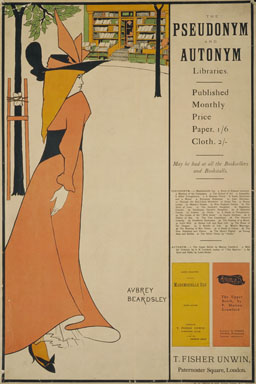
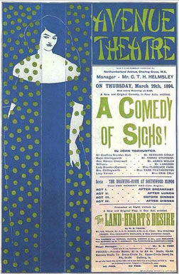
Advertisement is an absolute necessity of modern life, and if it can be made beautiful as well as obvious, so much the better for the makers of soap and the public who are likely to wash.
The popular idea of a picture is something told in oil or writ in water to be hung on a room’s wall or in a picture gallery to perplex an artless public. No one expects it to serve a useful purpose or take a part in everyday existence. Our modern painter has merely to give a picture a good name and hang it.
Now the poster first of all justified its existence on the grounds of utility, and should it further aspire to beauty of line and colour, may not our hoardings claim kinship with the galleries, and the designers of affiches pose proudly in the public eye as the masters of Holland Road or Bond Street Barbizon (and, recollect, no gate money, no catalogue)?
Still there is a general feeling that the artist who puts his art into the poster is déclassé—on the streets—and consequently of light character. The critics can discover no brush work to prate of, the painter looks askance upon a thing that achieves publicity without a frame, and beauty without modelling, and the public find it hard to take seriously a poor printed thing left to the mercy of sunshine, soot, and shower, like any old fresco over an Italian church door.
What view the bill-sticker and sandwich man take of the subject I have yet to learn. The first is, at least, no bad substitute for a hanging committee, and the clothes of the second are better company than somebody else’s picture, and less obtrusive than a background of stamped magenta paper. Happy, then, those artists who thus escape the injustice of juries and the shuffling of dealers, and choose to keep that distance that lends enchantment to the private view, and avoid the world of worries that attends on those who elect to make an exhibition of themselves.
London will soon be resplendent with advertisements, and, against a leaden sky, sky-signs will trace their formal arabesque. Beauty has laid siege to the city, and telegraph wires shall no longer be the sole joy of our æsthetic perceptions.
Now, as to the technicalities of the art, I have nothing to say. To generalise upon any subject is to fall foul of the particular, and ’twere futile to lay down any rules for the making of posters. One’s ears are weary of the voice of the art teacher who sits like the parrot on his perch, learning the jargon of the studios, making but poor copy and calling it criticism. We have had enough of their omniscience, their parade of technical knowledge, and their predilection for the wrong end of the stick. But if there be any who desire to know— not how posters are made—but how they should be, I doubt not that I could give them the addresses of one or two gentlemen who, having taken art under their wing, would give all necessary information.
—Aubrey Beardsley. First published in The New Review, July 1894.
Online reference source: Literary Remains of Aubrey Beardsley, http://www.cypherpress.com/beardsley

Fig. 1. Aubrey Beardsley, Pseudonym and Antonym, Poster advertisement for T. Fisher Unwin, London, Color lithograph, 1894

Fig. 2. Aubrey Beardsley, A Comedy of Sighs, Poster advertisement for the Avenue Theatre, London, Color lithograph, 1894


