“What got you interested in animation?”
During the last decade of teaching animation to college students, I have regularly asked this question as part of a beginning of the year introduction for first-year undergrads. I’m always curious to find out what has driven my students into this maddening and crazy art form that requires the creation of twelve to twenty-four separate images to create one second of action. Invariably, one of the most the most common answers I hear is, “To bring my characters to life.” This is an understandable answer on many levels. From a scientific viewpoint, movement, or the ability to grow and respond to outside stimuli, is one of the necessary elements of life; and of course, one of animation’s most salient and enticing attributes is the ability to make anything look like it is moving and therefore potentially personified.[1] Abstract shapes, a sorcerer’s broom [Fig. 1] or a little girl’s interior emotions can all be given personality—life—through the way they appear to move on screen. But my students’ well-considered answer has also suggested to me that in many of their eyes, movement is the essential element of life, rather than the other qualities they have used in conjunction with their characters up to that point, such as well-crafted drawings, stories, dialogue, designs, or a sequence of images. This attitude is also common in the professional animation industry. It is concretized in the title of one of the classic books on the subject, The Illusion of Life, by Frank Thomas and Ollie Johnson, two of the “nine old men” at the Disney Studios who helped craft the form of animation during the studio’s golden age between the mid 1930s and late 1960s.[2]
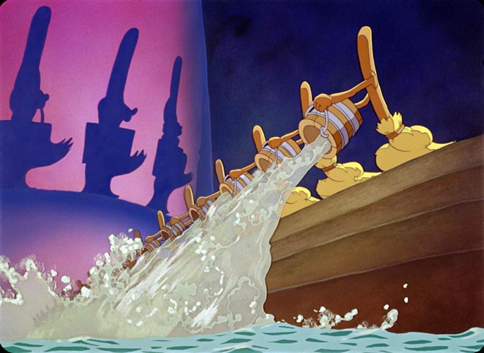
Fig. 1. Walt Disney, Still from Fantasia, 1940
Of course, technically, there is no movement in animation. The actions of characters and things seen on screen are a deception, an illusion of motion created in our minds, brought on by a series of sequential still images presented at intervals that force the eye and brain to put them together kinetically. The difference between the twenty-four images per second in an animated film and the three or four images of a comic strip isn’t movement; it is the impression of time in between the pictures. Single, static images are still the currency of both forms.
On one level, the technical reality of static images in animation is of no consequence, as we still experience them as movement. But the fact that the process of making animation is actually one of designing and organizing motionless forms is a pointer towards the other possibilities that still images have in impressing meaning, emotion and “oomph” onto us. Just as motion is only one of six or seven attributes necessary for something to be considered alive in the realm of biology in the dominion of storytelling there are other virtues besides movement that infuse breath into our creations [1]. What my first-year students don’t always fully appreciate as they begin their journey into motion-media is that learning the additional methods that animation, comics, and picture books use to beguile the brain are as important to bringing characters and concepts into the glow of the maternity ward as the mirage of mobility is.
Manga vs. Anime
A wonderful way to examine these mechanisms is by comparing similar stories and concepts portrayed in both static and moving mediums. An excellent case study for this musing is found in the dystopian epic Akira by Katsuhiro Otomo. Akira ran as a serialized Japanese manga story in Young Magazine from 1982 until 1990 and was adapted into an animated movie, directed and co-written by Otomo, in 1988. Both the manga and the film were financial and critical successes and widely regarded as having great influence on the fields of manga, anime, and film in the following decades. In each of Otomo’s interpretations of this story about a post World War III radical punk Neo-Tokyo, there are dream and hallucination sequences involving one of the story’s lead characters,Tetsuo, a member of a high school biker gang who has developed psychic powers as the result of a motorcycle accident. The dream sequences serve to give us a first-person perspective inside Tetsuo’s increasingly deranged mind as his powers grow and outside forces try to manipulate him.
Application of Comic Text
So how does Otomo make a dream feel more alive using static images? The opening of one of the Manga dream scenarios starts by showing Tetsuo’s transition from the waking world into a dream world and then mixes in a number of key moments from his childhood memories and interactions with characters from his current life. On the first page of this section [Fig.2], Otomo uses three techniques unique to comics: the manipulation of the shape and arrangement of the frames, the visual depiction of sound, and the use of motion lines. All three of these tactics are woven together to enhance the character’s passage into the dream world.
Otomo begins by employing the power of the drawn word. In the first panel we see Tetsuo framed by two girls on a bed; one of them is gasping in the foreground, wearing a bewildered expression. We are at the tail end of a carnal romp, which began with Tetsuo giving the girls government-issued pills that lessen the intense headaches he’s been having because of his increasing psychic powers. He has become addicted to them and believes they help everyone relax. In fact, they have had a dramatically negative impact on the girls, who are now locked in frozen agony, fighting to breathe. This becomes more apparent in the second panel, a small frame that displays a tight close-up of the original girl with an even more intense open-eyed expression. The sound effect, “DODOM,” is drawn in a bold, shadowed type in the top right corner of the frame. This text acts as a symbolic drumbeat, signaling the beginning of the excursion into the interior of the dream world. Its volume and importance increase in the third panel, as it grows in size and moves to the foreground of the frame, overlapping a tighter composition of just the girl’s eye. Otomo uses the close framing and more prominent display of sound to increase both the drama of, and immersion into, the dream. Each beat brings us closer. The next two panels have no sound effects or word balloons, which creates an atmosphere of silence in contrast to the previous frames. The last panel on the page breaks this stillness by reintroducing a drawn sound effect, “VVVRROOOOO,” portrayed in a curved wave-like form. This type is less bold in its appearance and is placed at the bottom of an image of a cropped motorcycle tire, the one recognizable element in the panel. This sound effect acts as an indication that we have fully arrived into the dream. As opposed to the previous display of sounds, which functioned as symbols of the transition and acted more as musical rhythms than diegetic noise, the realistic motorcycle tone tells us that we are in the present moment of the scene and what we hear is what we see.
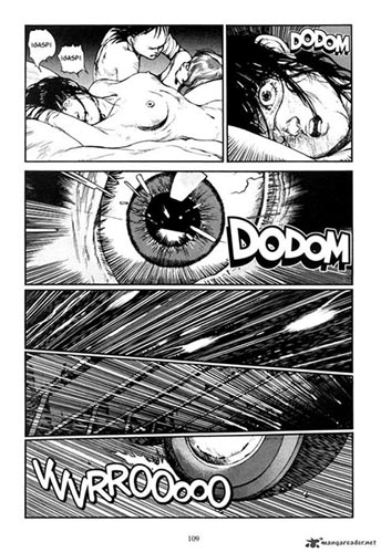
Fig. 2. Katsuhiro Otomo, page from comic book, Akira (manga) Vol 4., 1987
Although comics, at least in their printed, non-interactive form, are a purely visual medium, the use of sound as portrayed by graphic text depictions and word balloon dialogue is not limited to a conveyance of speech and sound effects. It can also function in similar ways to the audio in film by providing rhythms, punctuation, volume, emotion, and locus to a story. Comics differ from film by operating through a specific language of visual codes and symbols, and the complex process of interpreting these codes, through the reader’s back and forth fusing of words and images, can bring a unique experience of sound and meaning.
In her essay “The Comic Book’s Soundtrack,” Catherine Khordoc writes about the role of sound in comics as delivered through word balloons:
Balloons transmit the message to be read, literally, but they also convey another code, which must be deciphered partly through the act of reading as well as through the interpretation of symbols. The code essentially tells the reader how to read the message, or in fact how to hear it. Through a variety of devices, this code indicates which character is speaking and when, the volume and tone of voice being used, the language being spoken or the presence of a foreign accent and the sounds of their actions. [3]
Otomo has used these visual codes to create a soundtrack, one that signifies a shift from the exterior to the interior point of view, creates a silence that we can note and marks our arrival into a different state.
Our brains have the curious power of allowing us to “hear” things that we are reading but not hearing out loud. This little understood phenomenon is referred to as the inner voice, which is the voice you might be hearing now inside your head as you read this sentence. Recent scientific studies have confirmed the existence of this inner voice and have suggested that a brain signal called corollary discharge plays a vital role in our perception of internal speech. [4] The translation of the words and symbols used in comics into interior sounds and voices heard in our heads through the active process of reading can, in some instances, create a much more intimate experience, one that is psychologically alive without any trace of movement or actual sound.
Motion Lines
The effect of the text as sound becomes even more powerful when working in conjunction with the additional tools Otomo employs. While words are used to indicate the start of our journey into the dream, as well as signaling our arrival there, Otomo enhances the sense of a traveling experience with a series of motion lines. Motion or speed lines are a technique developed in comics to help indicate movement and action on static images. They range from a series of thin lines trailing behind a path of movement to delineate its shape and direction, to repetitions of the outline of people or objects, drawn behind their action to suggest a blur or trace of their path of action. As pointed out by Scott McCloud in his book Understanding Comics, some comic artists, such as Gene Colan, experimented with photographic streaking effects, using motion lines to mimic what happens to moving objects in front of a camera at different shutter speeds. Colan played with effects that mimicked an anchored camera and ones that showed blurred backgrounds as if a camera were panning with the moving action. Japanese comic artists have made great utility of the motion line in their work and have brought a slightly different understanding to its application, often referred to as subjective motion [5]. The subjective approach attempts to make readers experience the motion themselves, rather than watching other people or objects move from the perspective of outside observers.
Otomo employs the subjective motion line technique throughout the dream transition. Starting in the second panel, he uses thin inked lines at the top and bottom of the frame that start wide and then narrow to a point in the direction of the girl’s face. Similar to the first sound effect, which also appears in this frame, these lines act as texture and punctuation, a symbolic shake to let us know something has shifted. However, coupled with the information in the following frame, these lines also indicate movement towards the girl’s features.
In the next panel, Otomo uses an extremely tight frame of just the girl’s eye, and the action lines now flow from the edge of the frame and point directly to the edge of her eye. A second, smaller ring of lines is repeated at the interior edge of the eye and continues towards and slightly overlaps parts of the iris. Small white shapes, resembling the light reflecting in the girl’s pupil, also stretch and overlap the eye itself, following the path and perspective of the action lines back towards the edge of the frame. The visual design created with these shapes of light and motion lines closely resembles the Stargate sequence in Stanley Kubrick’s 1968 film, 2001: A Space Odyssey [Fig.3], in which astronaut David Bowman travels through space and time via a vortex of colored lights [6]. Whether Otomo was consciously referencing that scene isn’t clear, but his rendition also creates a similar feeling of not only traveling, but moving into a new dimension.
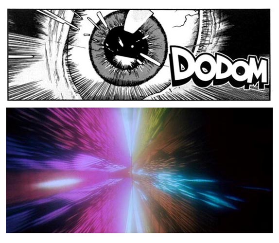
Fig. 3. (A) Katsuhiro Otomo, frame from comic book, Akira (manga), Vol 4., 1987
(B) Stanley Kubrick, still frame from movie, 2001: A Space Odyssey, 1968
The Frame
The next two panels of the page are filled with nothing but motion lines and complete our passage into Tetsuo’s dream world. Here Otomo also uses the shape of the frames to heighten the experience. Each panel is filled with the lines that started in the previous panels but are now drawn at diagonal angles and run in opposite directions, producing tilted images. In film, the tilted image, created through the use of the “Dutch” camera angle, is often applied to engender a sense of unease or imbalance. Otomo adds to this sense of unease in this sequence by creating a counter contrast with the frame shapes. The two long and narrow frames are stacked on top of each other, run the width of the page and are tapered at opposite ends. The images feel squeezed at each end, and the shift back and forth from this narrow, almost claustrophobic area to a slightly more open space suggests not only unease, but a surreal and turbulent journey.
The second of these two panels also includes action lines, but these lines are accented with a trace of images lying behind them. These images appear to be jointed wood strips that would be used to support a structure above them [Fig. 4]. This simple addition not only suggests that we are traveling, but that we are traveling underneath something, such as the subconscious. The shape of the last panel on the page evens out so its horizontal lines are almost perfectly parallel again. In this instance, the frame, along with the visual sound effect and the introduction of the image of a motorcycle tire, is telling us that the turbulent passage is over. We have arrived somewhere, and things are now more balanced. However, because the frame isn’t perfectly horizontal, we might also feel that something is still not completely right. We may have arrived, but we are still in a dream. The shape of these last three panels and their relationship to the rest of the page help pull the reader more viscerally into the sequence.
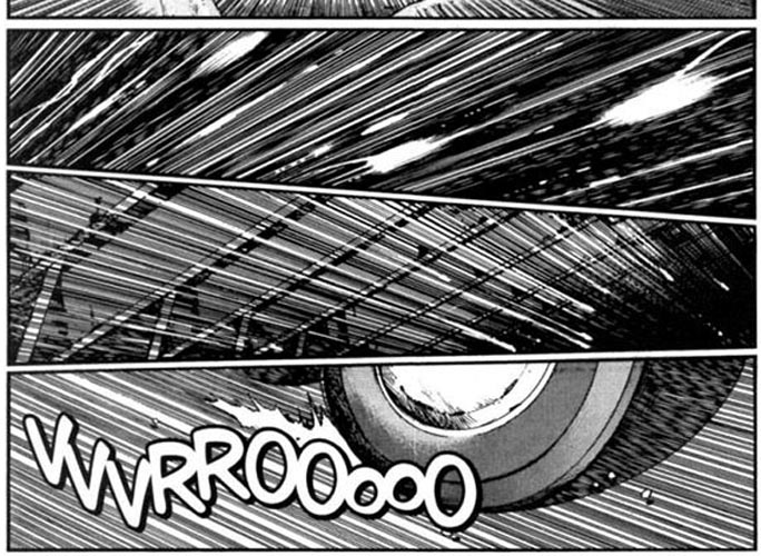
Fig. 4. Katsuhiro Otomo, partial page from comic book, Akira (manga), Vol 4., 1987
Panels and the Page
In both narrative film and comics, time is compressed; the experiences we see are broken up into individual, contained segments; and the reader or viewer is left to fill in the gaps. In film this is done through shots; in comics it’s achieved with panels. In both mediums, the relationship of these time blocks to each other has a large effect on the whole. The theory of montage developed by Sergei Eisenstein and a number of other Russian filmmakers in the 1930s asserts that the way a person experiences one shot can be greatly influenced by the shots that come before it, or as Eisenstein puts it, “montage is an idea that arises from the collision of independent shots.” [7]
These relationships allow filmmakers to shape the emotion and meaning of any individual shot based on how it’s arranged in a sequence.
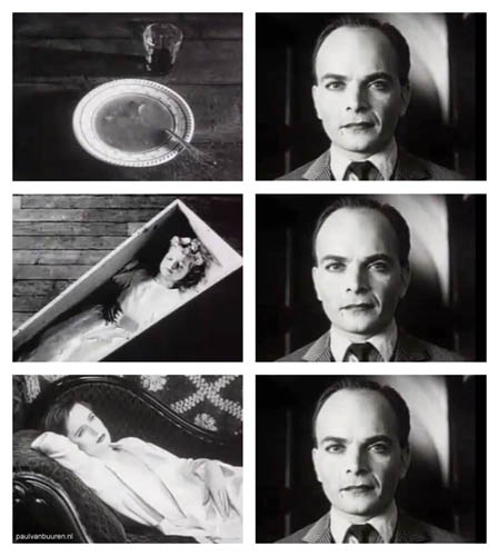
Fig. 5. Lev Kuleshov, Stills from filmaker's Lev Kuleshov's film experiment on the effects of editing. Kuleshov placed three different clips before the same clip of Tsarist matinee idol Ivan Mosioukine and showed them to an audience. When questioned, the audience believed Mosioukine was acting differently in each clip [8]. The psychological phenomenon of one image carrying influence over to affect another became known as the "Kuleshov Effect" in 1921.
In comics, this same holistic effect on meaning is produced not only by the relationships of the panels to each other, but with the whole page on which they are arranged. Unlike film, which can control when a viewer sees a shot and for how long, the comic page must contend with a viewer’s wandering eye and peripheral vision. Will Eisner refers to the two-elements that form this aesthetic and narrative relationship—the panels and the page—as the controlling devices in sequential art [9]. The ability to shape and angle the panels, overlap them on top of each other, arrange them in specific patterns on a page or to place them on top of a larger background frame allows for a multilayered emotion and meaning for the reader. This is created not only by the content of each panel and how they are ordered, but by the meta-language of the whole space.
A powerful example of the integration of controlling devices within a page can be found in the work of comic artist Frank Miller from his graphic novel Sin City [10]. In the page below, Miller ties the whole scene together by deploying overlapping and tilted frames, laid out against a background image.
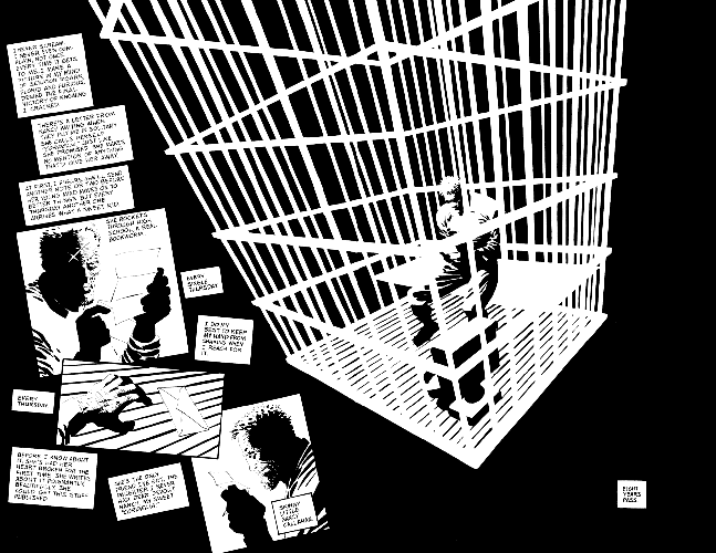
Fig. 6. Frank Miller, page from comic book, Sin City, Vol. 4: That Yellow Bastard, 1996
This layout also serves to direct our eye through a number of time frames. The large background image of Marv, the main character, in a caged solitary confinement is the first thing we are pulled to visually and creates a sort of frozen montage effect for the page. It does so by casting the three individual frames to the left of the splash image of Marv with an emotional tone of loneliness and despair that otherwise might not be read into those panels. When we move to the narration boxes, we see Marv telling us of his experience in solitary and the relationship that he has with a girl who writes him letters. The first and third panels show Marv reading a letter. The second panel, titled at a relative angle to the other two and overlapping them, shows Marv’s hand reaching for an envelope at the bottom of his cell. Miller also tilts the three narration panels that are meant to accompany the second panel, giving the wording a punctuation and direct connection to the frame. By overlapping and tilting the picture frame, Miller creates a moment removed from the first and third panel, a memory within a memory. This interlude is a stirring emotional interruption. “Every Thursday,” reads the dialogue, Marv receives his one connection to the outside world from the person that he considers to be his only friend. Without the overlap and tilt, the frame would read as a sequential step in the narration, rather than a poignant focus.
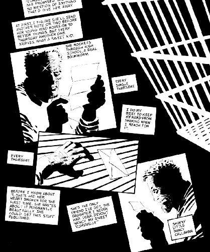
Fig. 7. Frank Miller, partial page from comic book, Sin City, Vol. 4: That Yellow Bastard, 1996
Miller’s Sin City page is a prime example of how many things a static piece of art can do to bring a sequence to life. We are able to travel through multiple moments in time, while sitting within an atmosphere of despair and hearing the voice of a character in our heads, as he and the rotated frames tug us into an acute emotional moment.
While Otomo’s use of panels as they relate to the entire page in Akira is not as complex and dramatic as Miller’s in Sin City, Otomo is always aware of its holistic impact on the story and employs it effectively throughout the series. His skill at integrating the controlling devices of the comic form is a testimony to the generative power of static images. Within just the opening page of a six-page dream scene, Otomo has created the sensation of traveling into another dimension—the unconscious mind of a character—while engendering a surreal sense of unease and confusion. He also creates a penetrating awareness of both a chaotic voyage and an arrival at a more stable chimera. All of this is generated using just six images, or one quarter of a second of time if the pictures were employed in an animated sequence.
Animation
In one of his animated portrayals of Tetsuo’s hallucinations, Otomo exploits not only movement, but one of the seeming shackles of film structure as opposed to comics. While the comic format allows the reader’s eye to stray and loiter, film’s imposed frame order and viewing time gives the viewer no such visual leeway. Otomo uses the constraints of this format to create a unique filmic montage supplemented with points of exaggeration, motion blurs, sound and glow effects to affect an audience in a way that the comic format cannot, by acting much more on the subconscious rather than conscious mind.
The animated dream sequence I will focus on here has a completely different setting from the manga version but shares the same basic goal of having us experience the strange happenings inside Tetsuo’s head. It starts with Tetsuo joyriding through the city with his girlfriend on a motorcycle stolen from his friend Kaneda. During the ride, the two encounter a rival bike gang, who beat up Tetsuo and sexually assault his girlfriend. Tetsuo and his girlfriend are rescued by Kaneda and his other friends. Tetsuo tries to seek revenge on one of the remaining rival gang members by beating him mercilessly. He becomes frenzied, and Kaneda steps in to stop him. Tetsuo reacts angrily and combatively to Kaneda’s interference, and as he does so starts to look pained and disoriented, wobbling away from the others and holding his head. He is becoming more deranged as his powers increase.
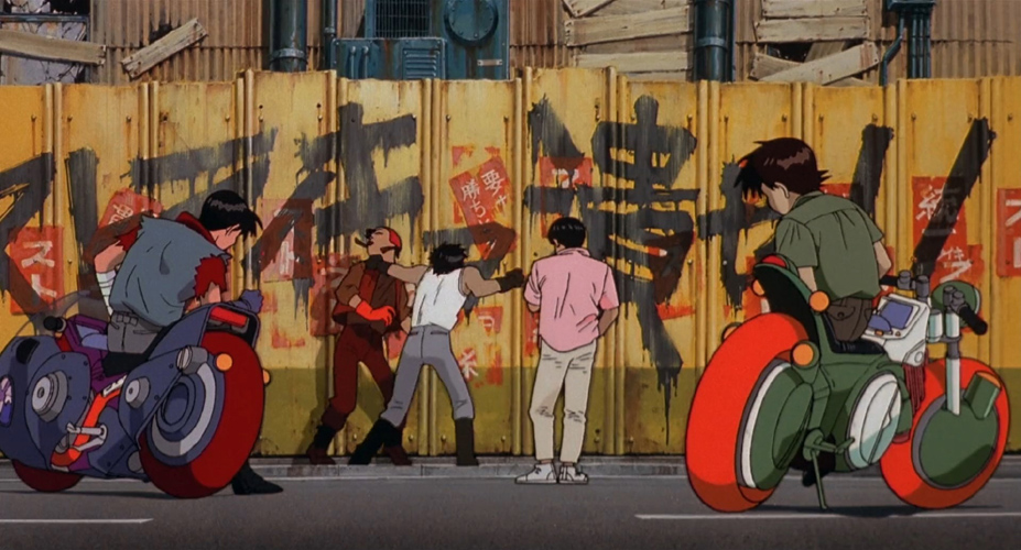
Fig. 8. Katsuhiro Otomo, still frame from movie, Akira (film), 1988
Time Control and Montage
Otomo starts the hallucination scene at the moment that Tetsuo begins to lose control. As he did with the comic, Otomo uses a sound notation to announce its start. Instead of the heavier, more dramatic beat suggested by the drawn word “DODOM” in the comic sequence, Otomo uses a light chime as Tetsuo enters his dream state. This sound comes in conjunction with a series of fifteen remarkable images in all [Fig. 9], which are on the screen for less than a second in total. The images are a mix of light flashes and pictures of things that will happen in Tetsuo’s future. We see a negative outline of his body, followed by a completely white frame, then two slightly different shots of a grotesque mass of mutating and bursting flesh, then a tilted frame of a building being hit by flying debris, an image of an electric lighting burst, an image of the character Akira, for which the movie is named, an image of Tetsuo’s girlfriend trapped in a compartment of fleshy material, and then finally four sequential frames of Tetsuo himself standing up in what is the mutated form he will inhabit later in the story. Most of these images are only on screen for one frame, or one twenty-fourth of a second. This length is significant because the images are not on screen long enough for the conscious mind to even register them.
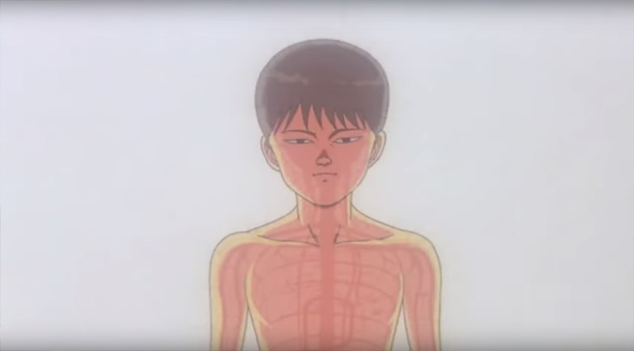
Fig. 9. Katsuhiro Otomo, still frame from the flash montage sequence, Akira (film), 1988
In traditional film there are twenty-four frames in a second. While this number can be slightly different when shooting in video or digitally, most animators work under the assumption that the minimum number of frames an action needs to be on screen to be effectively seen is about five [11]. In the 1950s the phrase subliminal advertising was coined based on the idea that if advertisers flashed a suggestive word on the screen for one frame it could not be read by the conscious mind, but it would be picked up subliminally and influence the buying choices of a viewer. Studies have proven this to be partially true under controlled lab circumstances, but none have shown it to work in real world situations [12]. A famous false study by an ad executive named James Vicary, who claimed in 1957 that he had flashed the words “Eat Popcorn” and “Drink Coca-Cola” at speeds that were imperceptible during a movie, reported that popcorn and Coke sales had risen dramatically in the lobby afterwards. He later admitted that he had not done sufficient research to prove this claim, but that did not stop the rise in popularity of the term “subliminal advertising” and the public’s fear and acrimony about it as it was adopted into the public lexicon.
While the single frame’s power to force people into an orgy of popcorn consumption may be wanting, the inability of the mind to fully register something that is only on screen for one-frame is clear, and that reality has a dramatic impact on the effect of Otomo’s rapid-fire montage. He presents a burst of sound and imagery that suggests something to us, but we can only feel it, rather than know it intellectually. We experience it as Tetsuo might, witnessing flashing fragments of things that are mysterious and disturbing, jabbing at our mind in an almost taunting fashion. This reaction is only possible through the cinematic presentation, which forces us to see the images for a fraction of a second.
The Guts of it All
By presenting three interludes of the flash sequences, intercut with shots of Tetsuo staggering around the sidewalk writhing in pain, Otomo sets up the most deep-seated and shocking part of the dream sequence. These surreal bursts of imagery have pushed us off balance and have prepared us for the fact that almost anything could happen next. And not surprisingly, it does, as the director combines animation’s dazzling attributes of movement and exaggeration with the cinematic weapons of sound and cunningly designed edits to produce an exquisitely jarring effect.
After the third subliminal flash, Otomo cuts to a medium close-up of Tetsuo holding his head. His eyes are bulging and he is shaking his head back and forth tossing off large beads of sweat. Behind him we see the surrounding city, and then he cries out, “Akira, I don’t know who that is!” We’ve arrived at a crescendo in Tetsuo’s psychic nightmare, and we see him being fully struck by the extremity of his situation. He’s lost control and he doesn’t know what to do. Here, Otomo uses movement, not of a character, but of two effects, a glow coming out of Tetsuo’s head and a blurred double vision movement of the background to force us to see and feel this frantic moment [Fig.10]. We see what is happening to Tetsuo’s brain through the pulsating glow, and we experience what he might be feeling through the moving background.
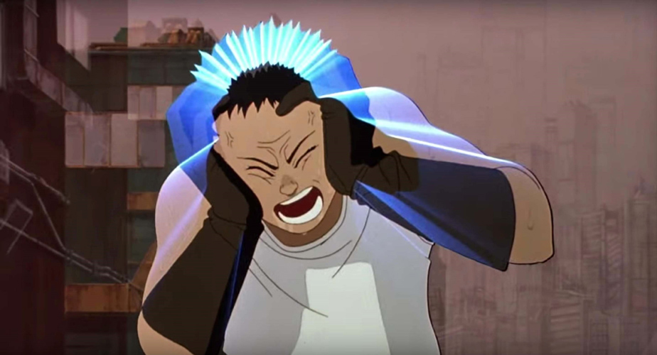
Fig. 10. Katsuhiro Otomo, still frame from movie, Akira (film), 1988
On the exact frame after the background stabilizes, Otomo cuts to a shot of Tetsuo’s feet. Tetsuo is up on his toes, as he has been numerous times in the scene, indicating that he is wobbly and off balance. We see his knees hit the ground and we hear the end of his curdling scream that began in the previous shot. Now the sidewalk under Tetsuo’s knees starts to split apart. This effect is amplified by a camera shake, creating the sensation that the ground is shifting beneath him. This imagery becomes even more unsettling by Otomo’s use of a surprising soundtrack in the background. There are none of the expected rumbling, cracking or breaking noises that would normally accompany a scene of such a dramatic destruction. Instead, we only hear the actual noises that would accompany a dreamer: breathing. This breathing is loud, making it sound like it is right on top of us; yet Tetsuo is quite far away in the frame.
The next cut features a shot looking up at Tetsuo from below the sidewalk. We are in the dark underbelly of the city, as well as in Tetsuo’s subconscious. There is a small hole at the top of the frame where light is shining through. Tetsuo’s frightened face is seen peering down at us. Boulders and rocks are falling away from the sidewalk and towards the viewer as the hole widens and the camera shakes become more dramatic. Strange green pipes and mechanical devices are shown pulling away from the frame, leaving only blackness. As Tetsuo’s breathing becomes harder and more strained, the sidewalk finally gives way, and he falls through the hole, plunging towards us while emitting a clamorous death cry. Here, Otomo completes the dramatic moment by cutting back to the previous shot of the sidewalk, matching the earlier camera angle that looked down at Tetsuo’s knees on the pavement. Otomo designs this cut to precisely match the timing between the two actions. This gives us the sense that the new shot of Tetsuo falling forward to catch himself on the sidewalk is a portrayal of the impact at the end of his dramatic drop in the previous shot, rather than a return to his starting position.
By cutting on the action of Tetsuo’s fall through the sidewalk, Otomo effectively sets up the scene’s climax. As Tetsuo’s hands break his fall, his shirt rips open and a grotesque and jumbled display of blood and guts falls out of his body and onto the sidewalk [Fig. 11]. The intensity and strangeness of this moment is magnified by Otomo’s choice of sound for this shot: complete silence. We are struck much harder by this absence than by any piercing sound effect that could have been concocted for this gelatinous spillage. Our reaction is shock, confusion and disgust. Is this really happening? Where are we?
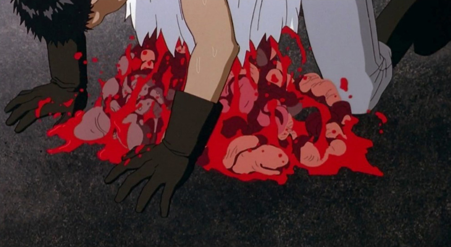
Fig. 11 Katsuhiro Otomo, still frame from movie, Akira (film), 1988
The next sequence helps us reorient ourselves, starting with a quick medium close-up of a stunned Tetsuo, breathing heavily, drooling, his bugged-out eyes staring down at the ground in disbelief. Sound reappears in the form of an abrasive gagging and breathing sputtering from Tetsuo’s mouth. Otomo uses this sound in a similar manner to his application of wording in the manga dream sequence. It is a trail marker on our navigation through the dreamscape. When we hear or see a change from sound that is used as a rhythm or counterpoint, to one that is reflecting the natural noise of the imagery in front of us, we know that we have been transported to a more stable position within Otomo’s swerving points of view. Tetsuo’s guttural rumblings that break the silence of the previous shot’s gory action lets us know that we have escaped the dream. We become further acclimated to our new position as we move to a wider shot of Tetsuo still hunched over the sidewalk waving his arms frantically in an effort to scoop back up his internal organs. Yet the sidewalk is bare; there is no trace of the violent expulsion. Otomo has made us objective observers again, watching a man floundering in the middle of a hallucination.
The ultimate strength of Otomo’s animated dream staging is found within its imposed viewing time. While the actions and the changes from objective to interior points of view could have certainly been shown in a comic book sequence, comic’s inability to reign in the roving eye makes it almost impossible to use a page of still images to affect the subconscious so starkly. Nor can the static layout use graphic images, like those of Tetsuo spilling his innards, to create the same sense of surprise and shock. Certainly the illusion of movement also plays a large role in how this sequence affects us, but without Otomo’s adroit use of the shot order, sound, and single image flashes, the experience would be much more mundane, much less “alive.”
Conclusion
As any optical illusion will prove, we see things with our brains, not our eyes. The fact that our minds can see pictures flashing before us at twenty-four frames per second as movement, or change how we interpret one event or image by the montage of things that precede or surround it, or allow us to hear voices that aren’t really there as we read words on a page, gives a skilled artist a bounty of entry points to affect emotions, create meaning or spawn life. An exceptionally able artist like Katsuhiro Otomo has found ways to portray vivid characters and adventures within two visual mediums by utilizing all the tools available to him. His ambidextrous abilities seem formed in part by film’s influence on Manga, as he mentioned in a 2012 interview with animation producer and historian Jerry Beck:
I used to love manga as a kid, and wanted to become a manga artist, and when I was in high school I got into movies as well. But being a director was quite a lofty goal, so I decided to become a manga artist instead. The world of manga, as created by Osamu Tezuka in Japan, had its methods rooted in filmmaking, so the two weren't so different. He was able to move onto making films from that point, as well. [13]
The understanding Katsuhiro Otomo developed for both forms not only allowed him to easily commute back and forth between the two, but also to make the dueling portrayals of Akira distinctly unique by capitalizing on each medium’s strength.
For today’s students pondering how best to give birth to their creations, Akira gives them much to consider. Animation’s virtue of motion is one of the primary things that make it such an interesting medium, but its capacity to stack so many different illuminating devices together is what makes it such a powerfully expressive art. Comics have only one layer to work with, but the myriad of things that can be done within that framework can still fill a multitude of pockets within a reader’s mind. Katsuhiro Otomo has shown us two ways of assembling collages of still images into acts of creation, and they are both thrilling. His work displays to us that the question, for students and practicing artists alike, really isn’t, “What is the best medium to use to bring a character to life?” but, “How does an artist best want to show that life?”
RESOURCES
[1] Koshland, Daniel E. “The Seven Pillars of Life.” Science, March 2002. http://science.sciencemag.org/content/295/5563/2215.article-info
[2] Thomas, Frank, and Ollie Johnston. Disney Animation: The Illusion of Life (New York: Abbeville Press, 1981).
[3] Catherine Khordoc, “The Comic Book's Soundtrack: Visual Sound Effects in Asterix," in The Language of Comics: Word and Image, ed. by Robin Varnum and Christina T. Gibbons (Jackson, MS: University Press of Mississippi, 2001).
[4] “Inner Speech Speaks Volumes About the Brain.” Association for Psychological Science, July 16, 2013. http://www.psychologicalscience.org/index.php/news/releases/internal-speech-is-driven-by-predictive-brain-signal.html
[5] McCloud, Scott. Understanding Comics: [the Invisible Art] (New York: HarperPerennial, 1994).
[6] 2001: A Space Odyssey. Dir. Stanley Kubrick. (Metro-Goldwyn-Mayer, 1968).
[7] Eisenstein, Sergei. The Film Sense (New York: Meridian Books, 1957).
[8] Lev Kuleshov, “In Maloi Gnezdnikovsky Lane,” in Kuleshov on Film. Writings by Lev Kuleshov, ed. by Ronald Levaco (Berkeley, CA: University of California Press, 1974).
[9] Eisner, Will. Comics & Sequential Art (Tamarac, FL: Poorhouse Press, 1985).
[10] Miller, Frank. Sin City, Vol. 4: That Yellow Bastard (Dark Horse Comics, NY: February 2006).
[11] Williams, Richard. The Animator’s Survival Kit (New York: Faber & Faber, 2001).
[12] “Does Subliminal Advertising Actually Work.” BBC News Magazine, January 20, 2015. http://www.bbc.com/news/magazine-30878843
[13] Sevakis, Justin. “Katsuhiro Otomo at Platform International Animation Festival.” Anime News Network, October 31, 2012. http://www.animenewsnetwork.com/convention/2012/katsuhiro-otomo-at-platform-international-animation-festival


