European mid-19th century Realism rejected academic norms that dictated the portrayal of idealized figures in idealized situations. Instead, the Realists chose to depict ordinary characters captured in the midst of experiencing life. This radical approach, as practiced especially by the French artists François Millet, Edouard Manet, Gustave Courbet and Honoré Daumier, established the footing upon which modern book and magazine illustration would be built, a kind of “illustration verité.”
The American illustrator Howard Pyle wrote in 1897, "…the true artist paints that which he sees in the world of nature, and not that which other men in studios tell him he ought to see. There are a few of us who hold that art, according to our understanding, is not an abstract and general effort to embellish a canvas with more or less beautiful forms and color, applied with technical dexterity, but that art is, or should be, the effort to represent nature as we know it. To our mind the artist is measured by the depth of his own impressions, and by his ability to make other men comprehend those impressions."[1]
From the last decades of the 19th century through the early decades of the 20th, illustrated magazines and novels were among the most popular forms of entertainment in America. The best illustrators of the time, including Howard Pyle, understood how important their pictures were to readers and were aware of the artist’s responsibility to create meaningful communication. Pyle and his students—the illustrators of the “Brandywine Tradition”—practiced a pictorial “narrative” realism. Their work served readers much the same way that cinema and later television would serve 20th century viewers. Illustration was intended to be part of an engrossing entertainment: scenes were set by the illustrators and “actors” were developed and then “directed” to be right for their roles. Images showing interactions between characters were meant to be clearly understood by the audience. Physical expressions and internal emotional impressions were conveyed through body language rendered faithfully and realistically. Like cinema, narrative illustration could even manifest as a series of frames. Seen throughout the length of an illustrated novel or magazine story, the frames captured significant moments in the narrative, the whole sequence and body of illustrations helping to convey a flowing, richly layered experience consisting of the author’s words, the artist’s images and the reader’s imagination.
Narrative realists, whether historic or contemporary, use similar methods. These include
- pose and body language to suit the written descriptions of the characters and their roles in a specific situation
- facial character and expression in accord with the developed personalities described by the writer
- physical and emotional interaction between characters
- literal scene depiction supportive of the narrative
- believable relationship of characters to their environment
- specific lighting within the environment as interpreted from the narrative
- pictorial composition designed to lead the viewer to an understanding of the narrative expressed within each picture through an intentional hierarchy of attention-getting and sequential cues
- limited color palette and use of intense color to further accentuate intended centers of interest
The artists who first embraced the idea of narrative realism were initially schooled in traditional fine art practices, because there were no courses that taught artists how to illustrate until Howard Pyle developed his. Under Pyle’s tutelage, young artists learned how to create a pictorially expressed narrative. They used their talent and training to faithfully and realistically portray a scene as described by the writer, but also resulted in a visually independent illumination of a captured moment as interpreted by the illustrator. For more than a hundred years Pyle’s theories have influenced the way that book and magazine illustration looks.
The Importance of Composition
Photographic reproduction technology was still in its infancy when Pyle began to work professionally, and he soon realized that, in order to achieve a successful illustration in publication, certain steps had to be taken in the art process that might better assure good reproduction. Pyle, when in New York City early in his career, saw that the closely hatched areas of his shaded pen drawings blocked up with ink when printed. Mary Mapes Dodge, the editor of St. Nicholas magazine, insisted that he visit the engraving company run by John Calvin Moss, so that he could better understand the printing process and improve his technique. Moss had invented the new “Moss process” for chemically sensitizing the surface of a wood block to receive an exposure from a photograph that had been taken of the original artwork. This method provided a huge advantage over the copied or traced translations previously used by allowing a more faithful interpretation of the artist’s original. Moss made it clear to Pyle that, in order to achieve good results from this new “photography-on-the-block” method, Pyle’s original pen and ink line-work needed to be crisp and secure and show distinct separations of lines, especially in hatched areas. In this way the wood engravers might have an easier time cutting between the lines as they prepared the blocks. This advice served as the beginning of Pyle’s understanding that, when an artist is illustrating for publication, the work must accommodate rather than resist the reproduction technology to be applied to it for mass replication. Pyle turned to the woodcuts of Albrecht Durer for inspiration and advice and, following Durer, kept the lines of his work (Fig. 1) clear and separated from then on, achieving much better reproduction as a result.
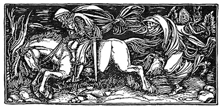
Fig. 1. Howard Pyle, Pen illustration for Otto of the Silver Hand, 1888
Reproducing tonal paintings was more difficult than reproducing line art. Although the Moss process displayed a photograph of the image in all its tonal range right on the block, the engravers still had to interpret the tones by hand, cutting corresponding densities of line masses to represent them. This was difficult and subject to carelessness or misinterpretation. In the examples shown, Fig. 2 is the original gouache painting and Fig. 3, the wood engraving. A close comparison reveals distinct differences in the tonal values. Pyle always created very deliberate tonal compositions that directed the viewer through a series of places of interest in the picture that, if seen in the proper sequence, conveyed a narrative. If this intentional sequence was misrepresented, the visual clues would not read as well, and the narrative could be miscommunicated.
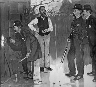
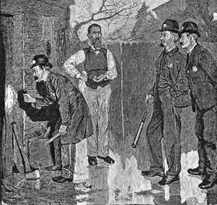
Fig. 2 and 3. Howard Pyle, "One of the policemen produced a bull’s-eye lantern." Story illustration for Rossiter Johnson’s Phaeton Rogers in St. Nicholas magazine, March 1881
In Fig. 2. Pyle has intended the primary center of interest to be the person wearing a white shirt and black vest. This area of maximum contrast demands to be seen first. The man’s head, dark in relation to the sky, rises up noticeably out of the gray fence behind him. His hand gesture and posture suggest that he is providing an explanation or introduction to the group of men at the right. His explanation concerns the left side of the picture where a policeman bends to examine something using his lantern. In a brief visual story, we are led to understand that the man in the vest is the narrator of events that had previously taken place on this property and which are now being investigated.
Fig. 3. is the engraver’s interpretation of Pyle’s painting. Here, the primary center of interest has shifted to the left, to the investigating policeman using the lantern. Within the large, gray value mass, a dense black shadow literally points to the white spot of light at the edge of a sliver of dark doorway creating an area of strong contrasts. The central character in the vest, his head and torso lightened by the engraver’s technique, is seen more now as a neutral part of the background. The helmets of the two police on the right have a stronger contrast with the background than in the original painting and therefore become a secondary center of interest. This reduces the man in the vest to being a third-level area of interest in the narrative—he has become an observer of the policemen’s actions rather than a protagonist. Pyle’s intended pictorial narrative has been altered by the engraver/translator through the misinterpretation of tonal structure.
The “halftone process,” first put into production in 1882, was a way of screening the continuous tones of a photograph or painting into a code of black dots of varying sizes depending on lightness or darkness of forms or changes in light. The human eye and brain accept this code as a representation of reality. Tonal illustrations could be photographed and the resulting negatives then exposed to sensitized copper plates. These would be subjected to an acid-etching process that cuts down the areas between the dots leaving the image dots high and ready to be inked on the press. Since all of this was achieved photographically, for the first time an artist’s work could be faithfully reproduced in mass publications without having to undergo translation by a hand-engraver and risk misinterpretation.
For Pyle, however, there were still problems of clarity. Printing papers of his day were often soft and porous, and when the halftone image dots struck the paper the ink would leach into the fibers, spreading their size and making areas of tonal differentiation less distinct. To counter this, Pyle made an effort to separate his values by clear degrees and to rely on simple compositions consisting of only three or four value areas or masses. He also recognized that complex illustrations might cause tonal problems on the press, and so he learned to keep his pictorial content simple. These practical realities merged with his growing experience of visual story-telling and led Pyle to develop a theory of practice which he would pass on to his students:
- Compositions using four or more major tonal masses will lose their impact, and subtle tonal complexities within masses will suffer problems in printing. Pictures using only three major masses will fare better. There can be tonal variety within a mass, but the individual values of objects must remain distinct from one another.
- A primary center of interest can be indicated through the creation of an area of maximum value contrast.
- Primary and secondary centers of interest can be indicated by a figure or object extending out from a value mass.
- An intense color, or a color different in hue from those around it, can focus attention on an area of interest.
Using value and color, Pyle could direct the viewer to look towards or away from specific areas in the composition and, exerting complete control over the visual elements, create compositions which would strike almost every viewer in the same way. In other words he could command a visual sequence of narrative understanding: look here first; look here next; look at this final area, and you have the complete message.
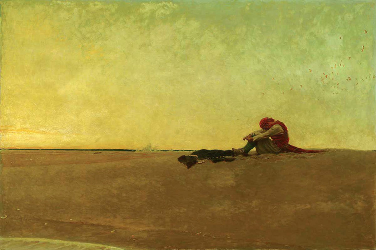
Fig. 4. Howard Pyle, Marooned, 1909, oil on canvas, Collection of the Delaware Art Museum
The simplest and most perfect example of narrative realism can be seen in Pyle’s painting, Marooned (Fig. 4). There are only three tonal masses: the sky, the sand and the pirate. Within the latter, the darkest tonal mass, there are nevertheless clear separations of values in the different articles of clothing. Compositionally, the dark value mass of the pirate juts up from the horizon into the light sky in high contrast, his red scarf adding to the imperative to “look here first.” The character’s mood is dramatized through body language. He is clearly despondent and the landscape (itself an actor in Pyle’s visual play) suggests why: the fine sliver of dark ocean that rims the top edge of the sand at the horizon shows that he is at a great distance from anyone or anything—and very much alone.
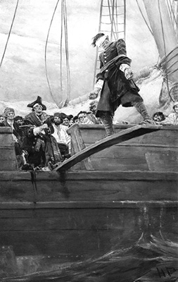
Fig. 5. Howard Pyle, Walking the Plank, 1887. Story illustration for Howard Pyle’s “Buccaneers and Marooners of the Spanish Main” written for Harper’s Monthly magazine, September 1887; Kelly Collection of American Illustration Art
In Pyle’s Walking the Plank (Fig. 5), an oil painting in a range of grays, there are also only three primary value masses: the sky, the hull of the ship, and the dark characters. Note especially that in this picture as well there is a “horizon,” this one formed by the hull, and, as in Marooned, there is a primary character, the prisoner, in a dark value which juts upwards into a light area of sky. A second character, to the left, also extends up out of the horizon showing a dark hat. Now Pyle has two centers of interest. He uses scale to communicate which one the viewer is to see first (the larger) and then directs the viewer to see the other character. Composition alone has provided a message: the smaller, secondary character holds the power to make the primary character “walk the plank.” Pyle then uses body language to tell viewers how the bound man on the plank feels: the character holds his arms rigidly against his bindings and clenches his fists as if to say that he will not go to his watery grave easily. He remains defiant in spite of his inevitable and impending death.
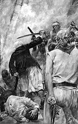
Fig. 6. Howard Pyle, Blackbeard’s Last Fight, 1895. Story illustration for Howard Pyle’s “Jack Ballister’s Fortunes” in St. Nicholas magazine, July 1895; Collection of the Delaware Art Museum
Fig. 6 is a masterpiece of composition and characterization. As in the previous examples, Pyle has created a compositional horizon made of two opposing value masses, but this time they are diagonally juxtaposed. Extending from this horizon is the dark “X” of a crossed saber and pistol shown against a light value area of gunsmoke. This is the first center of attention. The X shape quickly leads the eye to the dark-coated pirate and then down to the fallen figure at the lower left. The viewing sequence continues in a counter-clockwise fashion, as we are directed to look from the man on the deck holding his head, over to the pistol and then the arm and then to the full figure of the foreground character. As we look up, following the arm of the character, there is a final surprise: a man in the background is shown pointing a pistol directly at the viewer. There has been a massive circular directive with an exciting and playful punch line. But there’s more. The impression is that the man on deck holding his head is hurt, but still very much alive. Just above him on the lower left side is another character, hazed in the clouds of gunsmoke and shown in the act of falling. The pose and face are barely discernible, and yet somehow there is an understanding that he has received a mortal wound. Through Pyle’s skill, this character can be seen as very likely being already dead before he reaches the deck. Pyle’s ability to portray distinctly expressive poses is at its best here. The effect is purely cinematic. It is brilliant, exciting illustration.
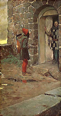
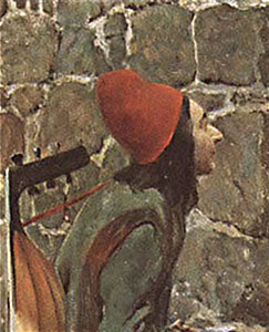
Fig. 7 and 8. Howard Pyle, At the Gate of the Castle, 1903. Story illustration for Olivia H. Dunbar’s “Peire Vidal, Troubadour” in Harper’s Monthly magazine, December 1903; Collection of the Delaware Art Museum
In At the Gate of the Castle (Fig. 7 and 8), Pyle constructs another small play. We see two characters and a deceptively simple portrayal of an environment. There is, in fact, a lot of information in the painting that supports the narrative. It is nearing sunset and overcast on an early winter or early spring evening. Middle tonal values dominate the picture and Pyle emphasizes the cloudiness and time of day by omitting cast shadows and by painting a pale yellow brightening of the sky set against a dark wall so that the viewer’s eye is drawn to it. Reflective puddles are evidence of a recent rain, and we can almost feel the cool humidity and heaviness of the air.
Through the use of a warm red color for the hat and leggings, Pyle directs us to look at the central character. Our attention goes to the head and to a pale face contrasted with dark hair. A reddish-brown strap leads the viewer to the black neck of an instrument and we understand that this is a musician, a troubadour. His pose is one of supplication: shoulders slumped, knees bent, hands clasped in front of his belly as he casts a small, hopeful smile to a figure in a doorway. Our focus is moved towards this second figure because of the contrasting black and white checked pattern of the man’s tunic and the light value of his head seen in contrast against the dark interior beyond the door. The musician has just made a request to enter and then entertain the master of the castle in exchange for food or pay, but the guard’s disdainful, downcast eyes and upright posture imply that he is unlikely to grant it.
Pyle believed in the necessity of an artist’s investment in subject matter. In this way and in this way only would the appropriate impressions be conveyed to viewers through picture making. The following is some of Pyle’s advice, recorded by his students:
— Identify yourself with the people and sense, that is, feel and smell the things naturally belonging there.
— One of the greatest pleasures in Art is living in a subject but it requires great mental training and it is hard, much harder, to acquire this mental training than to get technical training.
— In every human being there lies a thread that connects with every other life. Just in so much as we are able to express that underlying thought or emotion so that it will be recognized and felt by our fellow men do we succeed.[2]
During one of his composition lectures Pyle provided this critique of student N. C. Wyeth’s painting of an Indian and a panther in the forest:
Mr. Wyeth . . . you have been a little over dramatic with your figures. A panther crouching to spring on his victim is not possessed of passion but merely a desire to eat. He is cool, calculating, hungry. A wild beast devouring another takes its food in a natural way to it, as a tree absorbs moisture, rather than as a creature bent on revenge. When you throw your own self into the animal you make him human. You should consider him a being different from yourself. The action of the Indian, too, is overstated. He knows escape is impossible and his only hope lies in meeting the attack. So he would not lean back as you have him but would instinctively brace himself for the blow.[3]
More than simply portraying the words of the writer, Pyle advocated the artist’s total immersion in the characters and subject matter of their illustrations. Only that, he believed, would make the picture ring true to its audience. This is the essence of narrative realism.
Bibliography:
Estelle Jussim, Visual Communication and the Graphic Arts, (New York: R. R. Bowker Co., 1974): p. 109-11.
Resources:
[1] Howard Pyle, “A Small School of Art” Harper’s Weekly (July 17, 1897)
[2] Howard Pyle: Diversity in Depth, exhibition catalog for Delaware Art Museum. (Wilmington, DE: The Wilmington Society of the Fine Arts, 1973): p. 19 and 22. “Notes from Howard Pyle’s Monday Night Lectures, June-November 1904” recorded by Ethel Pennewill Brown and Olive Rush
[3]Ibid.


